Now that the local elections and the European referendum are out of the way, things are starting to settle down again and I have time to get back to my non-Council related, non-comic related work. To that end, I am back writing my novels; one of which is set in the Sol Invictus sci-fi setting I’ve been creating for the past few years.
In Sol Invictus, a significant minority ethnic group are the Lorentz Droids from the “twin planets” Golgotha and Hrothgarum Seedi; the former of which gave the group their name, “Golgothans”, while the other gave them their language, Visgutar (pron. “Fiz-goo-tar”). Because the majority language in Sol Invictus, Ösklisk, is written in an extended Latin alphabet and the Golgothans are a marginalised group, I wanted to emphasise the difference both sides of the divide in the story feel. To that end, I decided to go with writing Visgutar using a logographic writing system.
My first thoughts were to base the Visgutar system on Egyptian heiroglyphs because it would be visually quite an impressive-looking language. My only problem with that was the fact that it would result in some very large symbols in the story if I was to maintain legibility on the page. Reducing heiroglyphs to near the standard text size in a Western book doesn’t work all that well – just take a look at how large Wikipedia has to run its Egyptian symbols in order to make them readable. Also, it would look a mess if someone tried to write quickly, which is another thing I want to be feasible in this language.
For Visgutar, I want a set of logograms that look visually different to Latin characters; can be printed quite small in line with the rest of the text; and won’t look like a total mess if anyone was to hand-write them quickly (i.e. I want the potential for a “cursive writing system” version of the symbols). So for this, I turned to Chinese.
As regular readers of this blog may already know, I’m a huge fan of Eastern languages. I speak basic Japanese and I’ve been learning the Japanese writing system for a while now. Japanese writing is a ridiculously complex system involving 3 script sets, 2 number sets (Chinese and the international standard Indo-Arabic numbers we all use) plus the Latin alphabet for loan words, etc. That’s way, way too much for what I am looking for here, but the base Kanji/Hanzi (the Chinese characters they’ve imported) is a good starting point.
Chinese characters started out more like Egyptian pictograms than many people realise, and have evolved into the refined script we know today over thousands of years. For the Visgutar script, I decided to use a similar development sequence: begin with a pictogram that depicts a basic icon of the thing in question (e.g. a chair, a child, the sun, etc) and then develop the script through four or five progressively more streamlined versions until I got to the symbol that would be used for the language. The final version of each symbol is written in a Chinese script writing style, although not using entirely the same brush stroke rules.
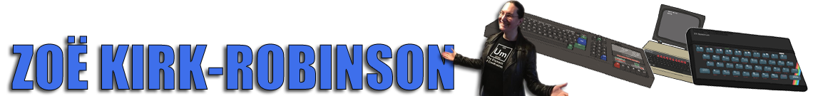
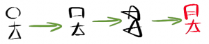
For example, I began with the symbol for “child” being a baby in a swaddling blanket. The starting pictogram looked like this:
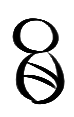
It’s a very basic image, because it’s supposed to be both easily identified and also written down simply. The process to develop the final symbol involved drawing and re-drawing the symbol until it was a far simpler design, then rendering it in a more Chinese style, as I mentioned before. The process went something like this:
Anyone who reads Chinese will recognise that symbol, since it’s very close to “Ear”. I never said this wouldn’t be confusing! Essentially, the brush strokes for the two halves of the body in the original pictogram have merged into single brush strokes, creating a rectangular baby. A lot of the original ease of understanding has been lost, but a small, easy-to-draw symbol has been produced. That’s what I was going for.
I re-did the process for both “man” and “woman” symbols, to produce a couple of extras. We’ll need those in a moment.
These two symbols look fairly similar at first glance, which I’ll admit is a concern. I’ll probably end up altering them later in the writing system’s development (the thought of joining the right side of the “head” portion of one of the symbols to the main diagonal stroke of the “body” portion did occur to me and that would create a more differentiated image) but they’ll do for now. The purpose of generating these symbols was to be able to discuss creating more complex symbols, using a “compounding” system.
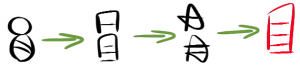
Let’s create a symbol for “boy”. Now it would be perfectly valid to not have a symbol for that word because we could instead simply put “man” and “child” next to one another and thus have the Visgutar equivalent of a hyphenated word (“man-child” in this instance). I liked this idea as a starting point but then decided that if symbols are written quickly, those two symbols would become joined up simply through fast writing. That got me to thinking about how basic Chinese symbols get combined into more complex ones – hence the “compounding” system for creating new symbols for word that would have been in common use for a long time in the Visgutar language.
By writing “man” and “child” side by side so often that they end up joined together as a new symbol, “boy”, we end up with this process:
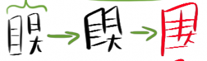
As with the head and body strokes merging in “child”, the strokes have merged between “man” and “child” to produce “boy”.
Not all symbols would develop in this manner, of course. Some complex symbols would have started out complex due to their original logographs; and some more modern symbols simply wouldn’t have had time to compound together, so they remain written as two (or more) symbols stood side-by-side. For more common words and ideas that would have been in use for a long time, this compounding system make sense for developing the Visgutar script, however.
So I’ve been playing around with this idea for the last few days. It’s a very, very basic set of ideas right now but I will be developing it over time and I’ll see where it takes me. In terms of the storytelling and the “look and feel” of the Sol Invictus world, it’s just what I need and I think it will make for some interesting additions to the novels.
Below is the full set of symbols and development notes I’ve produced so far. As you can see, it’s not very complex right now. I’ve got a long way to go.
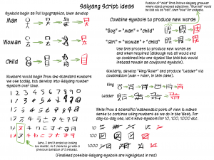
You may be wondering what the word “Saiyang” means. It’s the region of the planet Hrothgarum Seedi that the script developed from. Just as English uses the Latin alphabet rather than an “English alphabet”, Visgutar doesn’t use a “Visgutar alphabet”, it uses “Saiyang symbols”. Saiyang is a dead language that loaned its symbols and some of its grammar to Visgutar.
This might sound unnecessarily complex but the reason for it is fairly sound, I think. Basically, I wanted to avoid the standard sci-fi trope where Zergite aliens all speak Zergite, write in Zergite and come from the planet Zergiton. We’ve all seen it before and it’s silly (not to mention unrealistic).
By naming everything differently and giving a basic reason for why everything is named the way it is, I can produce the idea of both realism and backstory without having to spend ages explaining things unnecessarily. It’s a quick and simple form of world building that, if I ever want or need to, I can expand on later. That’s useful to a writer, and more fun for a reader.